Clean Content types
Nothing is more valuable than a "clean" InDesign file. If you like to have order in the frame types, this script is a blessing.
Empty and incorrect frames can cause problems in InDesign
InDesign distinguishes between the content types “Text”, “Graphic” and “Unassigned”. If used incorrectly, they can cause problems. Here we explain why and how the Octopus can help you.
In a nutshell:
What frame types do we have?
InDesign recognizes three different content types. “Text”, “Graphic” and “Unassigned”. In most cases, you do not actively and consciously choose one of these types, but rather indirectly by selecting a tool. If you place text, a frame of the type “Text” is created, of course, and the content type “Graphic” for images. Sometimes it happens that the wrong content type is found and then the difficulties begin.
And suddenly you can no longer see your layout because of all the frames
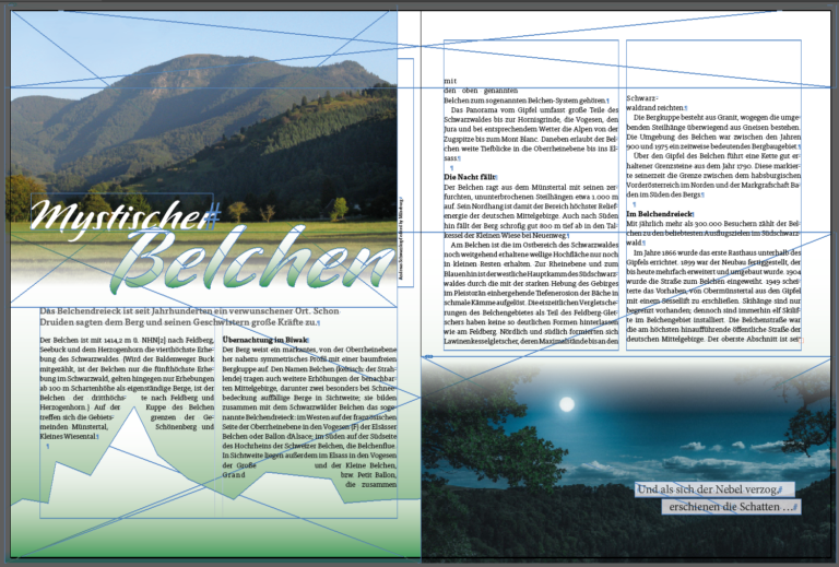
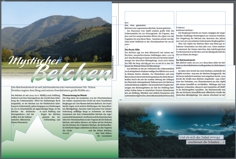
You know that too, don't you? You open an InDesign file and the entire double page is littered with frames that show a cross inside the frame in addition to the frame edge. These are empty frames of the "Graphic" content type. If their purpose is to be a placeholder for a graphic or image to be added later, that's certainly OK. But, as in the screenshot, the frames were used as a graphic element for colored areas. The "Unassigned" frame type is better because the annoying crosses are then missing.


Tip
If you have selected an empty frame in InDesign, you can change the content manually under the menu “Object > Content”. The script does this for you with a mouse click in the entire document.
An unwanted font - where did it suddenly come from?
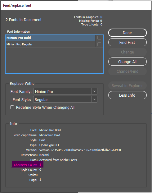
This problem will also be familiar to you. There are fonts in your document that should not exist. And then only a few characters.
The reason is "empty" text frames which, as above, are incorrectly used as graphic elements.
Here, too, it would be better if these frames were of the "Unassigned" content type.


How does the "Clean Content Types" script help?

Clean up everything with one click if desired
Use the "Convert" button to change the content of the empty frame to "Unassigned", as it should be. The script immediately activates the next empty frame.
You can use the "Delete" button to delete the frame immediately if it is superfluous. "Ignore", well, ignore the active frame.
"Convert all" cleans up
Use the "Convert all" button to change the content of all empty frames in the document to "Unassigned".
Then you won't have any superfluous crosses on your pages and no writing that doesn't belong there.
FAQ
No, this is at most an aesthetic problem. At most, the workflow could be impaired by an empty text frame in which a font is used that also causes problems during preflighting or packaging.
